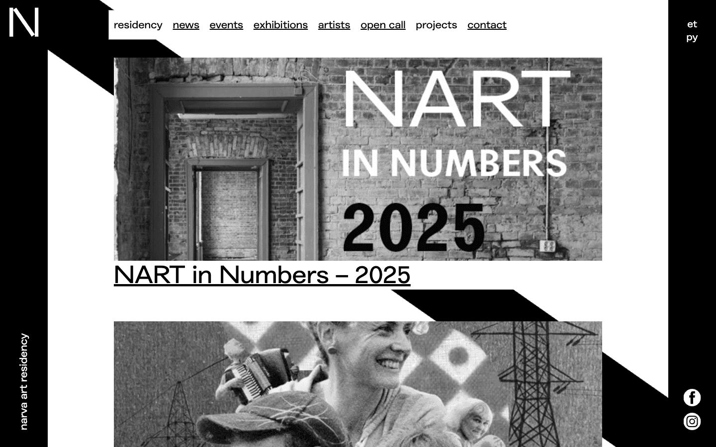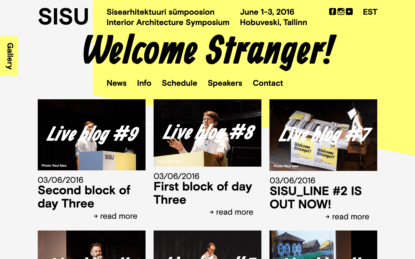
Case study / Viirus Theatre / Summer Season '26

A theatre website rebuilt for speed, accessibility, and everyday use.

Viirus needed a public website that could make repertoire, dates, tickets, accessibility information, languages, and cultural content easier to navigate without making the theatre feel generic.

Proof strip

The measurable gains support the story.

The metrics stay visible, but they no longer dominate the identity of the whole page. The case study starts with the service problem, then lets evidence enter in measured layers.

Performance62 to 99

Lighthouse mobile lab score

LCP8.8s to 2.0s

Largest Contentful Paint

Blocking time130ms to 40ms

Total Blocking Time

Carbon ratingF to B

Website Carbon Calculator

Context

A theatre website behaves like a public service layer.

Visitors often arrive on a phone with one urgent task: find what is on, confirm the time, understand the language and access context, then move toward tickets. The redesign treats those moments as the product, not as supporting details around the visual identity.

  • Repertoire, calendar, production, and ticket paths kept close together
  • Bilingual content handled as part of the visitor journey
  • Clearer page roles for both audiences and editors
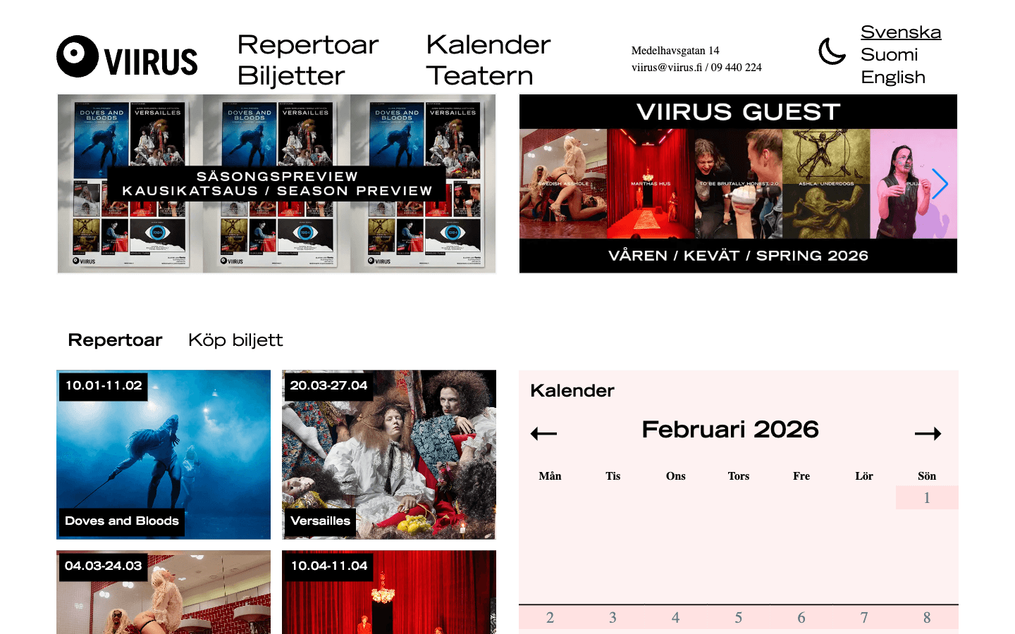
Screenshot of the Viirus Theatre website homepage.
The page starts from the theatre as a working service: mood matters, but orientation comes first.

Performance

Cultural content became lighter without becoming generic.

The site still carries large imagery and theatre atmosphere, but the implementation gives priority to what visitors need first. Modern image formats, responsive sizing, caching, and reduced blocking work make the experience feel calmer on phones and slower connections.

  • AVIF and WebP image delivery
  • Priority handling for above-the-fold media
  • Lower transfer weight for image-heavy pages
Viirus performance overview with improved load-time metrics.
Performance evidence is used as supporting proof, not as the whole identity of the case study.

Accessibility

Accessibility moved from checklist to interface behavior.

The work connects accessibility to things people can actually use: text size, spacing, contrast, motion, target size, focus styling, readable links, status messages, and keyboard-safe overlays.

  • Reading preferences available in the interface
  • Larger targets, stronger focus, and reduced-motion options
  • Clearer status states for search and dense calendar interactions
Viirus accessibility menu with controls for text, contrast, motion, and links.
The accessibility layer is presented as product behavior that visitors can control.

Discovery

Search, calendar, and tickets were treated as one journey.

For a theatre, discovery does not end at search results. Visitors need to move from interest to a specific performance state, then to ticketing with enough confidence that the date, language, subtitle, and availability information make sense.

  • Search dialog states with clearer feedback
  • Available, selected, sold-out, hovered, and focused calendar states
  • Ticket actions placed closer to the production context
Viirus calendar with hover and focus interactions for performances.
Dense theatre information becomes easier to scan when states are explicit and repeated consistently.

Privacy and sustainability

Less third-party weight improved trust, speed, and carbon impact.

Third-party embeds were replaced or gated behind consent. Reducing external work also lowered transfer weight, improved privacy, and helped the site move from an F to a B carbon rating.

  • Consent-aware analytics and embeds
  • Custom social gallery instead of default third-party loading
  • Lower page weight and less client-side work
Viirus privacy-first Instagram gallery replacement.
Privacy and sustainability are handled as design materials, not separate compliance footnotes.

Accessibility standard mapping

Features were tied to user impact.

The evidence stays, but it is framed as product behavior: how an interface helps people read, move, understand status, and complete the task.

FeatureCriterionUser impact
Sticky navigationWCAG 3.2.3Consistent navigation reduces cognitive load.
Focus ringsWCAG 2.4.7Keyboard users can always see where focus is.
Text scalingWCAG 1.4.4Layouts adapt when text is zoomed up to 200%.
Status messagingWCAG 4.1.3Screen readers receive loading and empty-state updates.
Search dialogWCAG 2.1.2The overlay can be navigated and dismissed without a keyboard trap.
Read aloudWCAG 1.1.1Long-form content has an audio alternative for visitors who benefit from listening.

Next case study

Bring the same product lens to another public service.

HAAM works best where a website has to carry content, operations, accessibility, performance, and trust at the same time.

Start a project

Help improve this website?

Optional analytics. Google Analytics and Clarity load only if allowed; form, email, and chat content are excluded.